We LOVE our logo. One of the things we love the most about it, is there are different variations that we can use. Some use our full "Heriot-Watt University Student Union" name, others simply use the HW motif.
But the best bit is the colours! We only use 3 main colours (pink, blue and grey) but mixing these up means our logo is fun and playful and can be used on anything!
We are 100% happy with you using our logo - we aren't keeping it under lock and key in the Marketing Team. Below are various logos you can use (they're the ones you will see us use most often). Feel free to stick them on anything you want, but don't forget we do have some ready-made templates for you in the templates section.
We've worked hard to create a logo that is easy to use and doesn't require a thick rule book. However, there are some basics you need to consider. If using the logo, please check the info below to make sure you keep "on brand"
Grab the logo here...
Click the logo you want, it will open in a new tab, then just right-click the logo and choose "Save image as..." to save it then insert it in to your document.
The "Full" Logo
These "No Background" logos should be used on a white background only...
The "Simplified" Logo
Please try to only use this version when the logo is to be used at a small size (e.g. in a social media avatar) so "Heriot-Watt University Student Union" in the Full logo would not be legible.
These "No Background" logos should be used on a white background only...
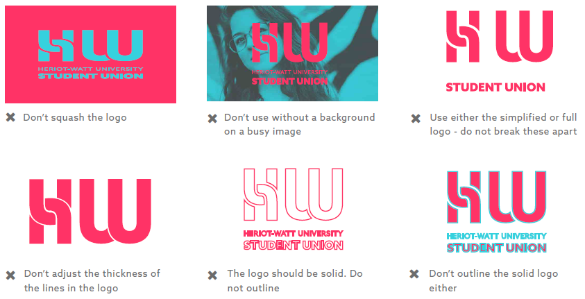
Some things to pay attention to...
We don't have a long list of rules about the logo, and you will see above our recommendations as to which logo should be used when. But there are a few things to draw your attention to that can make the logo look bad, and weakens our brand image. So please don't do the following:
